Author: admin

website

Refining Logo Placement on Albuquerque Small Business Sites

Small business websites in Albuquerque often overlook simple layout decisions that could make a big difference. One of the most common spots that gets ignored is the logo. Tucked in the wrong place or sized without mobile users in mind, a logo can easily go unnoticed. That might not sound like a big deal, but when someone is looking at a site on their phone under the summer sun, fast recognition matters. Mobile habits shift this time of year as temperatures rise, people scroll quickly, tap fast, and don’t stick around long if they can’t find what they’re looking for.

That’s why logo placement plays a bigger role in web design in Albuquerque than it might seem at first. Positioning a logo with care builds trust, eases navigation, and helps people connect with the business on first glance. It’s a small move that creates real clarity for both locals and visitors trying to get a feel for what your business is about.

Common Mistakes with Logo Placement

It doesn’t take much to throw off a visitor’s sense of flow. A good logo in the wrong location acts like background noise, not a brand signal. We’ve seen several avoidable mistakes on local business websites:

  • Placing logos too far from the top left, which is the first place most people expect to look
  • Making the logo so small that mobile users can’t spot it without zooming in
  • Using high-res logo files that don’t scale down, breaking the layout on small screens
  • Surrounding the logo with too many links, sliders, or popups that create visual overload

These missteps don’t just affect visuals. They set a confusing tone from the start. If a logo blends into a page, visitors may not remember who the business is or realize they’re even in the right place.

How Logo Placement Affects First Impressions

We’ve all had that moment where we land on a page and can’t quite tell what the business does. That’s usually a mix of layout issues, but the logo plays a big part. It’s a visual cue that builds the first impression before anyone reads a single word.

  • A top-left logo gives visitors something to anchor to as they scan
  • If the logo is hidden or misplaced, it can make the site feel scattered or untrustworthy
  • For local users and out-of-towners on the move, every second counts when deciding whether to stay

Overthinking it is easy, but what people usually want is speed. They want to click into a website and spot what matters right away. A clean logo near the top is one of the simplest ways to say, “You’re in the right place.”

Making Sure Your Logo Works on Mobile

In hotter months, especially in a place like Albuquerque, New Mexico, mobile use goes up. People are out more, walking from place to place, pulling up menus or business info while standing in line or driving with the AC on full blast. That means your logo needs to perform just as well on a mobile screen as it does on a large desktop layout.

  • Use responsive logo files that scale automatically from desktop to phone
  • Keep the logo within clean margins so it doesn’t overlap tap zones near menus or icons
  • Make the logo clickable, directing users back to the homepage with one tap
  • Avoid cramming it next to dropdowns or cart icons where fingers might accidentally hit other features
  • BK Design Solutions integrates fully responsive, mobile-ready logos on every custom website, ensuring the brand stands out on every device

Mobile browsing isn’t as forgiving as desktop. There’s no room for extra clicks or cluttered headers, especially when people are browsing mid-day with outdoor glare on their screens.

Think about how most users are on their phones when checking your business site. The less they have to pinch, zoom, or scroll, the better their impression of your company will be. If a logo is clear, accessible, and never overlaps with important icons or menu items, it makes the site feel more dependable. People will naturally gravitate toward brands that handle these core web needs without making users work for it.

Visual Balance and Spacing Around the Logo

A logo can be perfectly designed and still lose its impact if it feels like it’s fighting for space. Layout balance is where a lot of small business sites go off track. It’s not just about where the logo sits, but what surrounds it.

  • Leave breathing space around the logo so it stands out and isn’t boxed in
  • Avoid side-by-side placement with search bars, contact buttons, and long navigation links
  • Align the logo placement with the tone of your website, calming layouts use more negative space, while energetic designs might integrate the logo into the top bar with bolder spacing
  • BK Design Solutions pays close attention to negative space, helping Albuquerque small business sites feel spacious and welcoming rather than dense and crowded

This kind of balance helps guide the eye and sets user expectations within the first scroll. People pick up on order and hierarchy without realizing it, and a centered, well-spaced logo plays a big role in that.

When there isn’t enough room around the logo, a site can feel messy or stressful. People notice clutter before they recognize details, so making the logo stand out, but not overwhelm, should always be a priority.

Keeping Your Logo Consistent Across Pages

We’ve seen business websites where every page seems to have its own version of the logo, different sizes, colors, or placements depending on the section. It may not feel like a big deal when setting up pages, but it chips away at the user’s sense of flow.

  • Stick with one logo version and keep it the same across all headers
  • Avoid color shifting or adding special effects to the logo on promo pages
  • Keep the position locked to the same spot so users never have to look around to reorient themselves

That kind of consistency helps new visitors feel grounded and lets returning ones immediately know they’re in the right place. It also signals that someone has paid attention to the details.

A consistent logo builds trust while making the overall design easier to use. Changing it up between sections or pages can make users wonder if they’ve ended up somewhere new or if something is wrong with your site. Keeping things stable from page to page ensures a smoother visual journey and means less work for your visitor’s eyes.

Logo Location Done Right Means Less Confusion

We think of logo placement as one of those quiet decisions that speaks volumes. When done well, it helps people feel like the site works the way they expect it to. There’s less confusion and more confidence in how to move forward.

  • Use a single top-left logo location across the site
  • Maintain even spacing and avoid sliding elements that make it jump around
  • Treat logo layout like a welcome sign, not something visitors should have to search for

When summer browsing in Albuquerque means fast scrolling and quicker decisions, that sense of direction matters. Visitors don’t want to search for clues or second guess where to click. A logo in the right place makes things smoother from the start.

Clean page structure and consistent logo design won’t solve every problem, but they take one more thing off a customer’s mind as they use your site. In hot months when people are in a hurry and doing everything from their phones, those small bits of clarity go a long way.

Ready to make a lasting impression with your business website? Let BK Design Solutions enhance your site’s presence by optimizing key elements like logo placement. Our expertise in web design in Albuquerque ensures that your brand stands out in every digital interaction. Get in touch with us today to create a seamless and memorable online experience for your users.

WordPress

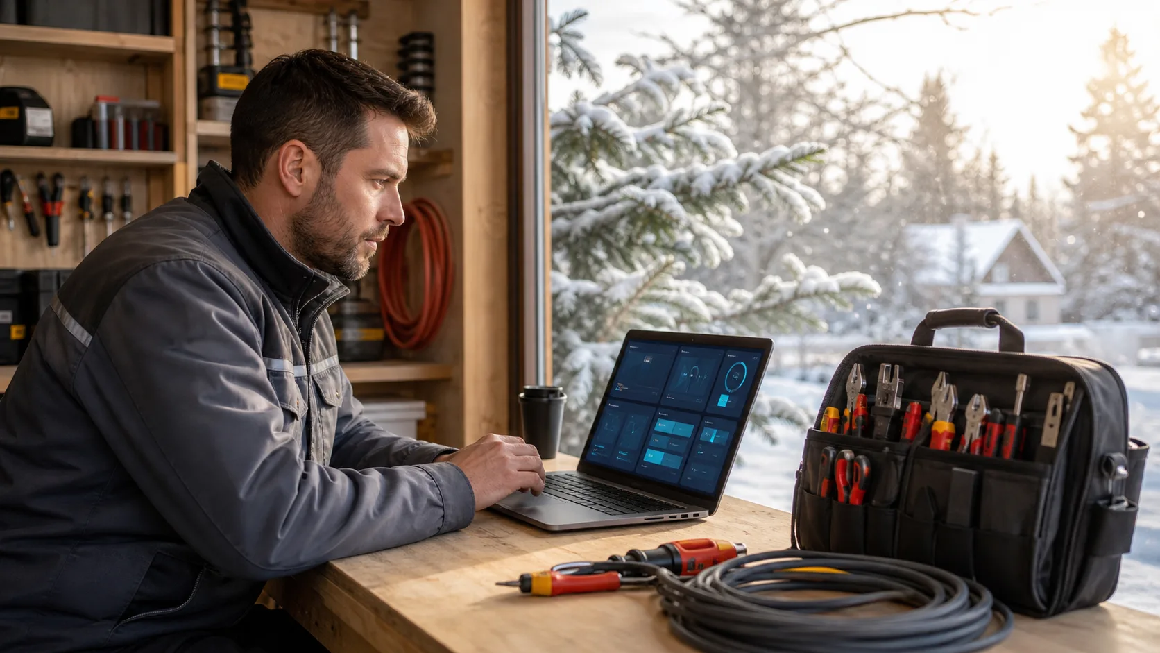
Is Managed WordPress Hosting for Contractors Worth It?

Homeowners who need a contractor are usually stressed, in a hurry, and on their phones. If your website is slow, broken, or offline, they do not wait. They tap the next company on the list. That is where hosting comes in, and why it matters more than most contractors realize.

In this article, we are talking about managed WordPress hosting for contractors. We will look at what it really is, how it compares to cheap DIY hosting, what it does for SEO and Google Ads, and how to decide if it makes sense for your business.

Stop Losing Leads to Slow DIY Hosting

Busy season hits hard. Phones are ringing, crews are booked, the weather is hot and stormy, and you are trying to keep up. At the same time, more people are searching online for help with things like:

  • An AC unit not cooling in the middle of a heat wave
  • Roof leaks after a big storm
  • Toilets backing up on a weekend
  • Power issues when everyone is running their systems

Now think about what happens if your website loads slowly or will not load at all. That homeowner with the emergency does not wait for the spinning circle. They back out and tap the next contractor that actually shows up fast on their phone.

So the real question is this: is managed WordPress hosting for contractors worth paying more than the cheapest hosting option, or is it just fancy marketing language? We want to answer that by looking at real risks and real benefits for trades and home service companies that need steady, trackable leads, not just a “nice looking” site that sits there.

Our team has worked with contractor sites that need to perform under pressure, so we see every day how tech choices behind the scenes impact calls, forms, and booked jobs.

What Managed WordPress Hosting Really Means

Managed WordPress hosting sounds technical, but the idea is simple. It means you have a team watching over the WordPress side of your website for you.

With managed WordPress hosting, you usually get:

  • Automatic WordPress and plugin updates handled for you
  • Server-level security and malware protection
  • Speed tuning so pages load quickly
  • Daily backups so you can roll back if something breaks
  • Support from people who know WordPress, not just generic web servers

Compare that with cheap shared hosting. With that setup, someone on your team is expected to pick plugins, run updates, fix errors, and deal with confusing dashboards. If an update breaks the site, you are stuck on long support chats while customers are trying to reach you.

Managed hosting does not mean you get a full redesign or new content stacked in unless that is part of a bigger service package. It is about keeping what you have running smoothly, safely, and quickly, so your marketing has a solid base.

WordPress itself is popular with contractors for good reasons. It is flexible, it works well with SEO and tracking, and it is pretty simple to update photos, service areas, and basic text without a developer every time.

The Hidden Costs of Cheap Contractor Hosting

At first, cheap hosting looks like an easy win. The monthly fee is low, and the site is online, so it feels “good enough.” But problems tend to show up when you are busiest.

Common issues with bargain hosting include:

  • Slow load times, especially on mobile
  • Random downtime during high traffic times
  • Higher risk of hacks and malware
  • Confusing control panels that eat up office time

Each of those hits your bottom line. Slow pages mean homeowners bounce before the contact form appears. Downtime means someone searching late at night for emergency help never even sees your phone number. If a form does not submit correctly, a solid job can vanish without you knowing it was there.

Even a short delay in loading can feel endless to someone sweating in a hot house or trying to stop a leak before it ruins the ceiling. In that moment, they are not thinking about saving you money on hosting. They just want help, fast.

There is also the hit to your reputation. A hacked site, a “not secure” warning in the browser, or a broken page after they tap your Google Business Profile link makes your company look careless, even if your field work is top-notch. Saving a little on hosting can quietly cost you valuable jobs over the course of the year.

Why Managed WordPress Hosting for Contractors Pays Off

Contractor demand goes in waves. Summer can crush HVAC companies. Storm season can flood roofers with calls. Pre-winter can get busy for plumbers and electricians as people prep for freezing temps or heavy rain.

When you run ads or send mailers on top of those natural waves, traffic to your site can spike. Managed WordPress hosting is built to stay stable and fast in those moments, so your website can keep up with your marketing.

You also get stronger security and safety nets:

  • Proactive protection against common hacks
  • SSL handled correctly so your site shows “secure”
  • Regular backups so a mistake or bad plugin can be rolled back quickly
  • Tech support focused on WordPress issues

There is also a big time savings piece. You are not staying late trying to fix a white screen, chasing random plugin errors, or bouncing between support emails while crews wait on schedules. Your staff can stay focused on customers and jobs, not tech headaches.

When your hosting is handled by people who understand trades and home services, they also know how important online forms, quote requests, and call tracking are. They can help make sure your tools are supported properly so leads do not slip through cracks.

SEO, Google Ads, and Hosting: How It All Connects

SEO and Google Ads are not just about keywords. The tech under your site matters too. Search engines pay attention to how fast and stable your site is, especially on mobile. If your pages load faster and stay online, you have a better chance to show up where local customers are searching.

Hosting quality has a direct impact on paid ads as well. When someone taps your Google ad and hits a slow or buggy page, they are likely to back out quickly. That wastes your ad budget and can raise your costs over time because the page experience is poor.

Think of two local electricians with similar ads and budgets. Both offer emergency service, both show up for the same search. If one site loads cleanly and quickly on a phone, and the other drags and stutters, the first one is going to win more calls from the same spend.

Managed hosting does not magically push you to the top of search results, but it gives your SEO and Google Ads work a strong, stable base. Without that, you can pay for clicks that never turn into calls because the site experience is too painful.

When managed hosting is paired with design, SEO, and ad work that are all aimed at real leads, not just traffic, everything supports everything else.

How to Decide If Managed Hosting Is Right for You

So, is managed WordPress hosting for contractors worth it for your company? A quick self-check can help:

  • How many leads do you get from your website each month, calls and forms, combined?
  • If your site went down for a day in peak season, how big of a deal would that be?
  • Do you or your staff really have the time and skill to manage updates, backups, and security?
  • Would missing even one or two big jobs per year hurt your revenue or schedule?

Many contractors think they do not get many online leads. But once call tracking and form tracking are set up correctly, the real volume can be surprising. People might find you through word of mouth, but still check your site or tap your number from Google before they call.

Common pushbacks we hear sound like:

  • “My site seems fine, I never hear complaints.”
  • “We get most of our work from referrals.”
  • “A family member set it up, it is good enough.”

The problem is, lost visitors rarely tell you they tried and failed to reach you online. They just pick someone else.

Peace of mind is a big part of this choice. Knowing that a team is watching your site, running updates, keeping backups, and ready to fix issues quickly can take a lot of weight off your shoulders when you are in the middle of your busy season.

When managed WordPress hosting is tuned for trades and home services, it turns your website from a “basic online brochure” into a dependable part of your lead machine, ready to handle the rush when demand spikes.

Get Started With Your Project Today

If you are ready to stop worrying about site security, uptime, and performance, we are here to help. Our managed WordPress hosting for contractors is tailored to the way you actually work, so your website supports your business instead of slowing it down. At BK Design Solutions, we handle the technical details while you focus on bids, clients, and jobs in the field. Have questions or want to talk through your needs first? Just contact us and we will walk you through the best options for your business.

Web Design

Why Animations Hurt Houston Websites More Than They Help

We hear it all the time. “Can you add animation to make it pop?” Some website owners in Houston really want their pages to feel fresh and exciting, especially with so many businesses crowding online space. A little movement can seem like a good way to stand out. The problem is, these flashy extras do not always make things better, especially when it is hot, traffic is heavy, and people are visiting your site from their phones while rushing through a summer afternoon.

We have been through more than a few Texas summers, and we have seen how websites need to adapt when heat, speed, and short attention spans are in play. Too many animations can actually cause slowdowns or distractions, and that is exactly what Houston users do not want. Let us look at what happens when motion gets in the way of user experience, especially when smart web design in Houston should focus on clarity and speed.

The Problem with Page Load Time

Animations are not free. They cost your website time every time someone visits a page. Even small animations, like those image sliders or scroll effects, still need to load. When someone is standing on the sidewalk in downtown Houston, sweating in the sun, and waiting for your site to load, every second matters.

  • Extra animation files add weight to the page, slowing everything down
  • Summer heat makes patience short, and slow pages are the first to get closed
  • When people leave your site fast, search engines notice and may drop your rank
  • Fast load time matters more than motion, especially when the visitor is just trying to find a phone number or check hours
  • BK Design Solutions audits every Houston website for speed, removing unnecessary scripts and optimizing images and code to improve load times

We have seen that animation-heavy sites often look great in planning but do not perform better once they are live. What users want is speed, not visual clutter. When there are extra scripts to load, everything on the website can slow to a crawl. This is especially true on hot days, when people are more impatient and more likely to give up. Every extra animation or graphic means more work for both your server and their device. Fast and direct is what works best for those visitors who just need a quick answer.

Mobile Users in Houston Need Speed

In places like Houston, where people spend a lot of time commuting or running errands in hot weather, desktop use tends to drop in favor of mobile browsing. That is where problems with animation really show up.

  • Phones can struggle with heavy effects, especially older models still in use
  • Houston summers bring heat as well as weaker mobile signals during peak hours
  • Small screens do not benefit from bouncy sliders or animated banners, they just feel slow
  • All BK Design Solutions web design in Houston is mobile-first, focusing on tap-friendly layouts and smooth, simple interactivity for busy users

When someone is outside, holding a hot phone and trying to click a link or scroll through your services, stripped-down design helps the most. Simple layouts load faster and are easier to tap through. If your animations get in the way of that, users click away and never return. It helps to remember that most mobile visits aren’t long, and visitors expect to find information quickly. So if they hit any delays, like loading a complicated effect, the chance they stick around goes down even more. As the city heats up and mobile phones become the main way people browse, it pays to keep your website light and quick.

Accessibility and Function Over Flash

Motion on a screen can be distracting or even overwhelming for some users. Houston has a large and diverse population, and that means we also need to think about the ways people process information online.

  • Excess movement can be frustrating for those who find it hard to focus
  • Constant sliding or blinking effects may confuse people trying to make a fast choice
  • Slower devices or inconsistent mobile networks can freeze or glitch when too many scripts load in the background

What helps instead is calm, steady design. Menus need to be obvious. Text needs to be readable. People do not want to guess where to click or have to wait while a header animation finishes revealing itself. Clear decisions often lead to faster next steps. When sites avoid extra movement and stick to basics, it makes everything easier for people to use, no matter who they are. Simple design lets every visitor find what they need, whether they’re in a hurry or just browsing. This is good for users who get lost easily or those with visual distractions.

When Animations Might Still Work

That does not mean animation has to disappear completely. At the right time and for the right reasons, motion can still be helpful.

  • Hover states that show a little color shift or boldness make buttons easier to find
  • Fade-ins can make section changes feel smoother without creating a delay
  • Animated icons, if they are simple and fast, can add small moments of clarity

Key rules still apply. The motion should never slow down clicks or distract from what matters. It needs to help guide flow or explain something. If it works in the background and does not add load time, it might be worth keeping. But if someone has to wait more than half a second to get back to your home page on a summer day in Houston, that is too long. Animation can be a small bonus, not the main event. Used carefully, it adds polish without getting in the way, like a button that lights up when you touch it or a panel that opens gently. It should always give quick feedback or help users see what comes next.

Stronger Without Extra Movement

When we work on local sites, we build with the season’s pace in mind. Every July, things move faster out in the real world. More people are on the go. More phones are being used in direct sun, on older batteries, through spotty Wi-Fi.

  • Simple clicks beat animated menus every time when someone is walking or driving
  • Clear pages get remembered, while flashy visuals often get closed and forgotten
  • Animations that do not serve a clear purpose just become clutter during peak hours

Our goal is always to make digital spaces easier to use, not more decorated. With web design in Houston, less really is more, especially when everything else feels busy, hot, and rushed.

Fast-loading, clean websites help people do what they came to do. And that is really the whole point. When a site works well in Houston heat, it is because it gets straight to the point. No extras. Just what matters.

Elevate your Houston business with a website design that truly works in the heat. BK Design Solutions creates efficient digital spaces, trimming unnecessary motion and focusing on speed to enhance user experience. Our expertise in web design in Houston ensures that your site remains fast and responsive, even in the summer rush. Get in touch with us today to refresh your online presence and meet the needs of your mobile-first audience.

homepage

What Users Expect from Albuquerque Homepages in Summer

In Albuquerque, summer works on its own schedule. Long days start early. The heat builds fast. Locals shift into a rhythm that keeps them moving, working, relaxing, or searching for what they need with less time to waste. That same pattern shows up when people go online.

During the hot months, people spend less time on each webpage. Attention spans get shorter, fewer people scroll all the way down, and most of them search straight from their phones. This changes what they expect to find on a homepage. If we are thinking about web design in Albuquerque during summer, we have to match the pace of the season. A homepage should feel quick, clear, and built to move with real people.

First Impressions Happen Faster in the Heat

In July, no one wants to wait for a slow-loading page, especially while standing outside or swiping during a busy day. The first few seconds matter a lot more in the desert heat. A homepage has to load fast, explain clearly, and offer something helpful right away or people will leave.

  • Keep image files light so pages load fast, especially on mobile
  • Show your value quickly with a simple tagline and clear heading
  • Place one strong call to action in an easy-to-find spot near the top
  • BK Design Solutions uses image optimization and performance checks on every Albuquerque homepage, making fast loads the norm for our clients

When we design with these things in mind, we make it easier for visitors to decide what to do next. People are not going to linger long just to figure out what a business offers. That first impression needs to land hard and fast.

What Users Want to See Without Scrolling

Scrolling requires effort, especially on a phone in the middle of a sunny day. That is why it matters what we show above the fold. People often leave a page before ever getting to the bottom, so we need to put top priorities right at the top.

  • Highlight contact info, location, or hours of operation
  • Include simple headlines paired with one high-quality image
  • Use buttons that invite action (like “Get Started” or “See Services”)
  • For Albuquerque businesses, we always move core info and calls to action to the highest visible section of the homepage so summer visitors never have to guess

These choices help Albuquerque visitors absorb what they need without extra work. If they cannot find it fast, they will probably leave and look somewhere else. In the middle of July, convenience wins.

Clear and Clickable: Summer Navigation Tips

Menus should not feel like puzzles in hot weather. When the heat kicks in, most people will not stick around to figure out a complicated dropdown. Clear navigation makes it easier to follow along, even while on the go.

  • Use short menu labels that make sense at a glance
  • Avoid multiple submenus that force users to tap too many times
  • Make icons big enough to tap without zooming in

Spacing matters too. Cluttered or crowded links become harder to use on smaller screens. Simple navigation helps people move between pages without friction, which keeps them on the site longer. Clean menus, bold buttons, and clear backtracking all make a summer homepage easier to use.

The Power of Visuals During Warmer Months

Photos speak faster than words. And during July in New Mexico, people are more likely to rely on visuals to decide what to do next. Bright, clean layout choices match summer’s energy, and fast visuals guide attention better than long text blocks ever could.

  • Use real images when possible (not just stock photos)
  • Keep visual styles light and uncluttered with lots of spacing
  • Place photos or icons near headers to support your message

A homepage should feel breathable. That sense of visual space helps people relax and connect with the content. When people are in a rush or already scanning on a hot screen, good visuals can give just enough context to get them engaged.

How Local Users Think During Summer

Albuquerque summer habits are different from other times of year. We see more screen time in the early morning or later at night, when temperatures ease up a bit. During the hottest part of the day, people are more likely to click quickly or check a site from indoors, usually on a phone.

If we understand these patterns, we can shape content to fit:

  • Publish updates or announcements with timing in mind
  • Make sure forms or contact options work easily outside business hours
  • Avoid layouts that only work well on large desktop screens

This is where local insight comes in. Smart design does not fight how people behave, it works with it. In summer, that means faster clicks, shorter visits, and layouts that support how people really want to browse. When we talk about web design in Albuquerque, that local pace matters more than ever.

Designed for the Way People Move

When summer ramps up, people move faster, and homepages have to keep up. Expectations shift with the season. Visitors arrive looking for something specific and want fast answers with as few clicks as possible.

By keeping content clear, placing top info near the start, making menus easy, and using visuals to guide attention, we match the moment. Adding in our understanding of Albuquerque’s pace in July, a homepage stops being just a landing spot. It becomes a help, not a hurdle.

Fast, focused, and grounded in real local habits, that is how we shape homepages that actually connect in the heat. At BK Design Solutions, we understand the importance of a homepage that connects with Albuquerque users during the bustling summer months. Our focus on web design in Albuquerque ensures your site is fast, clear, and mobile-ready, perfect for those on-the-go moments. 

Let us help you create a digital experience that resonates with local habits and keeps visitors coming back. Contact BK Design Solutions today, and see how we can transform your online presence this season.

menus

Crafting Clear Menus for Houston Audiences This Summer

Summer in Houston feels different. The heat rises early, afternoons stretch long, and almost everything people do leans more outside. Whether it’s checking hours from a patio or searching for lunch from a car, the way people use websites changes with the temperature.

Menus especially need to keep up. If they are hard to find or confusing to read on a phone, people move on fast. When we think about improving web design in Houston, we often start with the menu. A smart, simple design can keep users from clicking away before they even look.

We build menus with the season in mind. That means clear categories, flexible layouts, and buttons that people can tap without second-guessing. Backed by local habits and user-friendly tools, clean menus help short summer visits turn into real orders and booked tables.

Why Summer Behavior Affects Online Menu Use

Houston heat has a way of speeding people up. No one wants to spend too long staring at a screen when it feels like an oven outside. During summer, people check websites on the go, waiting in line, sitting in a hot car, or walking between shops. They are not settling in to browse. They are looking for quick answers.

That shift in behavior puts pressure on menus to load clearly and fast. If a page asks for a bunch of zooming, pinching, or scrolling, phone users will not stay. They will back out and look somewhere else.

  • Most users will scroll quickly and leave if the layout feels crowded or slow
  • Choosing where to eat or book is often a snap decision
  • Mobile menus need to exist front and center, not behind several taps
  • At BK Design Solutions, we build custom mobile menus and navigation structures for Houston businesses, making sure important actions are always visible and easy to access

Menus built for summer do not just work on mobile. They think like a phone user. They prioritize visibility in sunlight, ease of access, and straight-to-the-point structure.

Menu Layout Choices That Work for Houston Heat

When people click into a menu on a hot Houston day, they do not want the whole page to unfold in one long scroll. Instead, we focus on layouts built for quick choices without visual clutter.

One way to improve this is layout design that breaks menus into short, simple chunks. Clear categories help people get where they want fast, without reading everything in between.

  • Use short, high-level menu categories like Drinks, Lunch, Snacks, and Sweets
  • Add dropdowns or accordion sections to avoid endless scrolling
  • Set the most popular or seasonal options at the very top of each list
  • BK Design Solutions uses fast-loading menu layouts that keep selections at the top, allowing Houston customers to order or book even during hot, busy summer days

Order matters too. If a dish sells well or fits the season, it should be first in line. That way people do not miss what they are likely to pick and can decide faster with less guessing.

Another helpful approach is testing which categories people tap first. This shows what stands out and what might get missed. By keeping track of these interactions, menus can be adjusted to put what matters most right where customers see it, reducing hassle and speeding up every visit. Over time, these small tweaks make a site feel just right for local users.

Design and Color Tips for Summer Visibility

Sunlight does not just make phone screens hard to read, it changes how people see everything. A beautiful photo grid or dark background might look fine in the evenings, but outdoors that same menu can be frustrating.

To help people see clearly, we lean into contrast and simplicity. That starts with choosing lighter backgrounds and clear, straightforward fonts.

  • White or light-gray backgrounds improve screen readability outdoors
  • Black or dark text gives a strong contrast for easy reading
  • Avoid script fonts, especially in bright light, simple type is easiest on the eyes
  • Limit images and avoid tight photo grids that slow load times or crowd the page
  • All of our menus and user interface designs are tested for high-contrast visibility on phones, so Houston users can order fast, even when the sun is overhead

Photos can help a dish sell, but only if used the right way. It is better to feature one clean, well-lit photo per section than to line up four that load slowly or overlap. Cool tones and soft shadows tend to show better on hot screens too.

It also helps to stick to one or two accent colors. Overly bright palettes can make a menu harder to read, especially in direct sunlight. Calmer color choices make buttons pop without blinding people who are browsing on the go. When we design, we pick hues that stand out but still feel easy on the eyes in Houston sunlight.

Helping Locals and Visitors Navigate the Menu

Summer brings two kinds of users, locals hopping online to grab something quick, and visitors trying to figure out where to go next. Both groups need the menu to be clear without extra work.

Suppose someone from out of town pulls up the site on a hot evening. They do not know the difference between two items with local names. They are not sure if something is breakfast-only or still available. Straight labels save the day.

  • Use plain and direct section names like To-Go, Specials, or Breakfast
  • If items have local or creative names, add short descriptions
  • Let users filter by dietary choices or price level, making picks feel easier
  • Show takeout, delivery, or curbside options with icons or short links

Local customers already know what they like, but even they do not want to tap their way through five pages. If it takes them too long to see what is still available that day, they will settle for something easier. Clear options help everyone stay cool and stress-free.

Including a search option or filter can also make a difference. People like to sort by what matters most, such as price, portion size, or special features. Simple tools that help them narrow their choices quickly make the entire experience smoother, especially for a hot day or for someone trying a place for the first time.

The Quick Decision Advantage: Why a Strong Menu Pays Off

Good menus do more than get looked at. They make people decide faster. Whether someone is standing in line with their phone or comparing restaurants from a hotel room nearby, every second matters. A quick yes means one less customer lost to confusion or delay.

When we design with Houston’s summer patterns in mind, we reduce friction. Closely spaced buttons, outline-heavy layouts, and low-contrast text all make users bounce. But clear menus are like a green light. They feel smooth and help someone commit fast.

  • Clean structure keeps the user’s eyes moving down the screen
  • Bright, easy visuals mean less frustration in hot-weather browsing
  • Simple copy and obvious buttons turn views into actions

Menus that work in summer keep your visitors steady through the heat, whether they are around the corner or new to town. By meeting people where they are, online choices stop feeling like a chore. They become quick steps toward the next iced drink, takeout order, or sit-down meal.

Ready to refresh your digital space for the Houston summer heat? At BK Design Solutions, we understand the importance of a seamless menu that aligns with seasonal user behavior. Our team specializes in crafting user-friendly, aesthetically pleasing layouts that help your business thrive. Discover how our strategic approach to web design in Houston can transform your website into a potent vehicle for customer engagement. Connect with us today to explore the possibilities.

website

How Visitor Flow Changes for Albuquerque Sites in Summer

Summer changes more than just the temperature in Albuquerque. People shift their daily habits, spend more time outdoors, and adjust their routines to beat the heat. That shift carries over to how they use the internet too. From earlier starts to shorter sessions, the way locals scroll, search, and click changes fast once summer kicks in.

Anyone thinking seriously about web design in Albuquerque should be paying attention to these patterns. Online visitors become more selective with their time. They want faster access to info, and they’re more likely to bounce if a site slows them down or feels out of sync with what they need. It’s not just about how a site looks, it’s about how easily people can move through it.

When and Why Online Behavior Changes

Here in Albuquerque, summer schedules look different from the rest of the year. Heat builds by mid-morning, schools let out, and families tend to travel or switch to flexible routines. These changes show up in online behavior, especially for local-focused websites.

  • More people are using their phones from patios, parks, or indoor spots during hot hours
  • Shopping and browsing tends to happen earlier in the day or later in the evening when it’s cooler
  • Visitors are more likely to jump in, look for one thing, and leave if it’s not easy to find

That mix of heat, movement, and mobile use leaves little room for error. Sites need to run clean and direct if they want to hold attention. A typical summer visitor isn’t planning to explore every corner, they’re scanning for fast answers with minimal clicks.

What Slower Browsing and Faster Decisions Mean for Site Flow

As browsing slows down and decision-making speeds up, the way visitors move through a site changes too. Instead of starting at the homepage and clicking around, more people land directly on product or service pages. That means interior pages need to stand on their own without feeling like they’re missing context.

  • Homepages may see a dip in traffic as users come in from search results or links that skip ahead
  • Visitors are more likely to give up if a landing page feels cluttered or hard to navigate
  • Clear and simple menus become more important to help people take the next step without confusion

These patterns put more weight on each piece of the site. Whether someone lands on a contact form or a service section, they expect to know what to do without having to backtrack. Thoughtful layout and navigation go from being nice to have to something people notice when it’s missing.

Skimmable Design Helps Visitors Move Smarter

With attention spans shrinking and heat draining patience, people rarely read word by word on a website. They scan. That’s where skimmable design comes in handy. The easier we make it for someone to scan a page and understand what it’s saying, the better chance we have of keeping them there.

  • Use headings that are clear and useful, not vague or clever
  • Keep text blocks to two or three lines max whenever possible
  • Add bullet lists when breaking down important steps, features, or options
  • Use spacing and layout breaks to avoid visual walls of text

When it comes to web design in Albuquerque, these strategies go a long way. We’ve seen how locals interact with websites during hot months. They move quickly, get distracted easily, and respond well when the visual flow is simple and the next step is obvious.

Mobile First Becomes More Than a Trend

Mobile use always plays a role in site planning, but in the Albuquerque summer, it often leads the pack. More people are outside or commuting when they check a business site. That means we can’t assume users are seeing our pages on large screens anymore.

  • Font sizes need to stay readable in sunlight or on battery-saving screen dimmers
  • Buttons should be spaced for fingers, not mouse clicks
  • Images need to load fast and look good even at small widths
  • BK Design Solutions designs every site for mobile use, optimizing speed, tap areas, and readability in Albuquerque’s sun

When mobile layouts aren’t built with summer use in mind, bounce rates go up. Things like tiny menus, slow-loading photo galleries, or overlapping text push people away fast. Summer users don’t wait, they move on quickly if the page can’t meet them where they are.

Timing and Local Habits Matter

Staying in sync with local habits helps a site feel like it belongs. In Albuquerque, timing matters more than we usually think. There’s a rhythm to summer days that affects when people go online and how long they stay.

  • Mornings tend to bring more website visits before the heat builds
  • Midday activity slows down, with short visits from indoors
  • Evening browsing picks up again as people settle down or return home

This behind-the-scenes timing matters when thinking about content updates or business hours. If users find a site after hours and it’s not clear whether they can schedule, message, or learn more right away, they might not return. Our goal should be to make the experience feel helpful no matter what time someone lands on the site.

Designing with Seasonal Movement in Mind

Once we tune in to seasonal patterns, it becomes easier to adjust site flow. Every change in layout or navigation should help a visitor move through the site with less friction. That matters even more in summer, when local habits shift and users have less time or energy to waste.

Good summer layouts feel light and obvious. They welcome the visitor with easy choices, not long tutorials. The best experiences come from pages that guide people one step at a time without making them stop to figure things out.

When the temperature rises in Albuquerque, users browse differently, and that shift won’t wait for perfect conditions. If we want to meet locals where they are, we need to design for how they move, not just what they’re looking for. A small adjustment in layout or timing today can make a big difference in performance all summer long.

At BK Design Solutions, we understand the unique challenges and opportunities that summer brings for online engagement in Albuquerque. Our design strategies are tailored to accommodate the way local audiences browse and interact during warmer months. Let us enhance your site for optimal performance and a smooth, user-friendly experience. Discover the benefits of our expertise in web design in Albuquerque and ensure your site thrives in the summer heat. Reach out today for a consultation.

design

What Skimmable Design Really Means for Houston Sites

When summer hits Houston, so do shifts in online behavior. People get outside, run errands, and use their phones more often to search on the fly. That changes how they interact with websites. They do not dig through long pages. They scan. They skim. And they decide quickly whether to stay or move on.

This is why skimmable design matters when we talk about web design in Houston. Sites that are built for fast, simple reading meet people where they are. They save time and reduce friction, which helps businesses connect faster with the visitors who are already interested. Attention is short. Design has to keep up with that.

Why Skimmable Design Matters More in a Houston Summer

When the weather gets hotter in Houston, people tend to spend less time behind a desktop screen. Phones and tablets take over. That means smaller screens, casual scrolling, and less time spent digging through cluttered layouts.

  • Mobile use picks up hard during summer, which makes compact, readable design even more important
  • Hot weather makes reading longer text less appealing, people want what they came for without much delay
  • Clean, easy-to-read layouts help visitors find what they are looking for without second-guessing or squinting
  • BK Design Solutions specializes in simple layouts and compact page structures, maximizing readability for Houston clients in every season

During the warmer months, distractions are high and patience is low. If a site asks someone to work too hard to understand what is on the page, that visitor will not stick around. Design needs to clear the path, not slow things down.

Key Traits That Make a Site Skimmable

There is no single rule that makes a site skimmable. Instead, it is a mix of design choices that keep things easy to read both quickly and casually. Most visitors should not need to study your site. They should just glance, get what they need, and move forward.

  • Short paragraphs, three sentences or fewer, make content easier to digest
  • Clear headings and bullet lists break up long sections and create visual rest stops
  • Empty space between sections makes the layout calmer and keeps the page from feeling crowded
  • Logical flow means users do not have to guess where stuff is, they know what to expect and where to look

A skimmable layout respects the way people read online. It does not try to hold their attention with distractions. It just gives them answers faster.

Where Skimmable Design Shows Up in Real Business Websites

This is not a style choice meant for just one part of a site. Skimmable design should carry through every major page. If a user can land on any area of your website and get the point quickly, that is when design is doing its job.

  • Homepages often work best by showing off your top services or answers near the top, not buried behind layers of text
  • Contact pages should spotlight the form or phone number without distraction or scrolling
  • Service pages need strong subheaders and summaries, people do not want walls of text before they know they are in the right place
  • At BK Design Solutions, we craft service and contact pages for Houston businesses with actionable headings, focused forms, and prominent booking buttons

Every page should have a clear purpose, and it should be obvious what action the visitor can take next. Sites that achieve this are the ones people remember and return to.

Mistakes That Make a Website Too Hard to Skim

Even small design decisions can push people away. When content is not designed for quick reading, it starts to feel like a chore. That leads to frustration or bounce.

  • Fonts that are light gray or too small make it tough to skim, especially outdoors in the summer sun
  • Burying key information under long text blocks makes people give up before they get there
  • Using too many colors, fonts, or image styles turns the screen into a mess that is hard to follow

We have seen sites with good intentions fall flat because they asked too much from the visitor. When someone just wants to check your hours or book a service, do not make them work for it.

How Local Details Shape What Works in Houston

Houston’s digital audience moves fast. People comparison shop more without diving deeply into one site at a time. That puts pressure on design to deliver faster.

  • Many users move quickly between sites and will decide in seconds if yours feels clear and trustworthy
  • Mobile networks in some parts of Houston lag a bit during high-traffic times, so lightweight design matters
  • Showcasing local services and using familiar terms keeps navigation more natural for visitors who live nearby
  • BK Design Solutions reviews every web design project for Houston businesses on both slow and fast mobile connections, adjusting content size and structure to keep things responsive

Every small design tweak that improves mobile readability or lowers page load time helps in big ways across the city. If your content does not come through quickly or cleanly, it is likely your visitor will not wait around for it.

Let Your Website Be Easy to Look At

There is no need for a website to try too hard. In Houston summers, when users are on the move and attention is short, design needs to keep things clear and calm. Pages should lead people where they want to go without asking a lot.

Skimmable sites win not because they flash or shout but because they speak plainly. They highlight answers, show next steps, and never overwhelm the screen. When design takes the backseat and lets the visitor lead, that is when it starts to work.

Looking to create a website that effortlessly captures and holds attention during Houston’s busy summer months? Our team at BK Design Solutions specializes in crafting intuitive layouts that align with the unique browsing habits of your audience. Visit our service page for web design in Houston today. Let us help you make an engaging first impression and enhance your online presence in the heat of the Houston summer.

website

How Albuquerque Websites Can Prep for Summer Sales Traffic

Summer tends to speed things up in Albuquerque. Stores stay open late, events pick up, and people are out enjoying the warm nights. For local businesses, that means more website visitors, quicker decisions, and less time to make a strong first impression. If your site isn’t easy to use or takes too long to load, those visitors are gone before you even know they were there.

Web design in Albuquerque should always account for the way locals live, shop, and interact online during seasonal shifts. Summer brings faster movement, shorter attention spans, and more time spent on mobile. Getting your website ready now gives you time to fix problems before traffic surges.

Check That Your Website Loads Fast

Many summer visitors are browsing while waiting in line, walking around town, or sitting outside. If your site takes too long to load, they’ll move on before anything appears.

  • Start by compressing large image files without losing quality. Bigger banners or high-resolution photos often slow things down.
  • Reduce the number of scripts or heavy plugins running in the background. Features that aren’t needed during busy seasons can be turned off.
  • Test your site’s performance on both Wi-Fi and mobile data. People often switch networks when out and about, so both experiences should be smooth.
  • At BK Design Solutions, we optimize every site for speed, checking image files, script sizes, and server response so Albuquerque businesses can deliver fast results even in summer.

Speed shapes first impressions. A slow load time feels frustrating. A quick one builds trust right away.

Update Seasonal Content and Promotions

Albuquerque summers create unique buying patterns. From air conditioning service to sun protection and event tickets, attention shifts during this time of year. If your site still features winter deals or outdated events, visitors might think it’s not active, or worse, not local.

  • Swap out old headers and featured items with summer-ready content. Speak directly to what people are looking for now, not last season.
  • Use banners that are easy to close or small callouts instead of pop-ups that block mobile screens.
  • Prioritize your homepage and key landing pages first. Summer shoppers want fast answers and quick paths to take action.
  • Our web design projects for Albuquerque always include support for swap-in banners, seasonal layouts, and feature blocks to keep your promotions fresh.

Think of your website as a store window. If it doesn’t reflect what matters to customers right now, they’ll walk past it.

Make Your Site Easy to Use on Mobile

We expect mobile traffic to increase in summer. With more time spent outside, people rely on their phones more than desktops. Your website should be easy to tap through, read, and understand, even in bright sunlight.

  • Use larger tap targets and clear spacing between links. Visitors shouldn’t need to zoom in just to click a button.
  • Keep menus simple and focused. If your dropdowns are overloaded or your navigation feels clunky, users won’t stay long.
  • Remove anything that feels crowded. Too many images side by side or long blocks of text can feel like work when someone’s in a hurry.
  • BK Design Solutions designs with mobile spacing and simple interaction cues, so Albuquerque users get a clear, quick experience no matter where they browse.

Let the design support fast decisions. The easier it feels to use, the more likely someone is to stick around.

Align Website Design With Local Summer Trends

New Mexico summers are bright, and not just in temperature. We have long, sunny days that aren’t always kind to backlit screens. If your design is hard to read outdoors, it’s more likely to be skipped.

  • Push contrast. Dark text on light backgrounds helps readability, especially on phones in direct sun.
  • Make sure your images and text are spaced comfortably. Cramped pages strain the eyes.
  • Use casual, location-aware language. Think of phrases someone from Albuquerque would know, like referencing Balloon Fiesta season ends or monsoon prep. It helps your site feel familiar.

Designing with local users in mind makes your site feel like it belongs here, not just copied from somewhere else.

Test and Fix Forms Before Marketing Pushes

If someone wants to contact you, schedule a service, or buy something, the last thing you want is a broken form. Yet it’s easy to overlook how small issues can stop someone from following through.

  • Open every form, on phone and desktop, and try them yourself. Look for fields that don’t work, confusing labels, or things that get cut off on smaller screens.
  • Pay close attention to confirmation messages. After submitting a form, users should see something brief and clear. No one likes sending a request and wondering if it went through.
  • Review how long it takes to complete forms. If someone has to scroll through multiple screens to book an appointment, they might give up.

Good forms don’t have to be fancy. They just need to be clear, quick, and work the way people expect.

Get Your Site Ready Before the Summer Rush Hits

Once summer hits full stride in Albuquerque, it gets harder to make changes without disrupting current traffic. By preparing in early June, we’ve got time to catch bugs, tighten up design, and rethink messaging before sales pick up.

  • A cleaner layout makes people feel more comfortable exploring.
  • Fast load times keep visitors from bouncing.
  • Local references and fresh promotions create a sense of connection.

We treat seasonal updates as a reset. Not a total change, but a way to make sure every part of our website fits the time and place we’re working in. Albuquerque in June isn’t the same as January, and our website shouldn’t be either.

Summer moves fast. When our website can keep up, more visitors stay longer, click further, and come back again. That’s how we stay ready, not just for the heat, but for the hustle it brings.

As summer traffic surges, ensure your Albuquerque website is ready to capture more visitors with effective web design in Albuquerque. BK Design Solutions specializes in creating websites that enhance user experience, streamline mobile navigation, and reflect the vibrant local culture. By staying ahead of seasonal changes, you’ll connect more deeply with your audience and keep them engaged longer. Reach out today to refresh your site and elevate your online presence in Albuquerque.

Houston Sites

Why Houston Sites Should Rethink Image Placement in Summer

Houston summers hit hard. The heat peaks by midday, and with it comes a wave of fast-moving web traffic from people on the go. Whether users are walking from their car to a storefront or scrolling while waiting in line, they’re making quick online decisions under sunlight and sometimes on spotty mobile connections. This shift in how people use the web during summer affects not just load speed but image behavior, visibility, and layout performance.

When we think about web design in Houston, summer changes how we prioritize layouts. Image placement plays a big role in whether users stay long enough to take action or bounce because the page is not working for them. If visuals sit in the wrong spot or load too slowly, they hold people back. At this time of year, clarity, speed, and timing really matter.

Why Image Placement Changes Matter in Summer

How a site feels in summer is different from how it feels in other seasons. Higher temperatures affect our behaviors, and mobile use increases when people are out and about more often. This means fast-loading, easy-to-follow sites win the moment.

  • Long banners or auto-sliding galleries at the top of a homepage can slow people down. They block the most useful parts, like contact buttons or menu links.
  • Visitors do not want to scroll past three stacked photos just to find hours or a phone number. If you bury your calls to action under too many visual layers, many will not make it that far.
  • Cluttered layouts with multiple images tucked too closely together can be harder to follow, especially on smaller screens or in bright light.
  • At BK Design Solutions, our custom Houston sites prioritize compact hero areas and organize calls to action up top for quicker access during high-traffic seasons.

Shifting things around is not about limiting visuals. It is about moving photos where they support fast decisions instead of getting in the way.

The Effects of Climate on Image Format and Load Time

Let’s talk about heat, not just weather heat, but the kind that affects how devices handle site data. High-resolution images feel nice on desktops, but outdoors in summer? That is a different story.

  • People browsing in sunlight often deal with glare. If the page is slow or lagging due to large image files, they are more likely to give up.
  • High-quality images can use extra mobile data and strain devices left in hot cars or bags. Site speed matters all year, but it is even more noticeable when the heat makes phones more sensitive.
  • Lighter file types like WebP, and scaling down large images for smaller screens, help keep things moving smoothly. Fewer oversized visuals can also trim down the time it takes for a page to fully load.
  • BK Design Solutions optimizes all website images for fast loading on mobile devices and tailors file formats to user behavior in Houston.

We want sites that feel light on their feet during months when our users are dealing with heat, motion, and mixed lighting.

Making Visual Hierarchy Work for Summer Attention Spans

Summer users do not give us much time to earn their attention. They swipe fast and look for clarity right away. That is where visual hierarchy becomes more than just a design term, it is the secret to getting things seen in the right order.

  • Put high-value content toward the top of each page, and place supporting visuals underneath. Text should come before photos when the goal is fast detail.
  • Think about natural eye flow. The photo may look nice in one spot, but if it pulls the eye away from a call to action, it is doing more harm than good.
  • Short attention spans mean design has to guide users, not distract them. Each element has one job. If the image is just decor, it can live somewhere that does not block real decisions.

We want to help the user know exactly where to go next without guessing or hunting for buttons.

Image Colors and Lighting for Bright-Day Browsing

Light changes how we see photos. What looked fine in the office may appear dull or hard to read on sunny sidewalks. When someone’s phone is already dimmed to preserve battery, poor image color choices make pages harder to use.

  • Choose lighter photos with good contrast to make sure users can see what is on the page, even from a glare-prone phone screen.
  • Avoid dark or shadow-heavy images, which can become invisible in strong light. Bright backgrounds usually perform better during outdoor mobile browsing.
  • Photos and graphics should feel fresh and easy. In summer, people want to see clear, open visuals. Cluttered or text-heavy graphics make screens look too “full” and can be hard to follow.

We do not need to overwhelm the eye. One clean, high-quality image is better than five that blend into a gray blur when viewed outside.

Good Layout Choices That Help Mobile Summer Users

Space matters, especially on a phone. Where we place images plays into how content flows and how easy it is to take action. Big pictures above the fold might look pretty, but they often push down the content we actually want people to see fast.

  • Keep landing visuals short and clean. Let photos set the tone without dominating too much screen height at the start.
  • Buttons or interactive content should stay close to main visuals, not hidden below them. Users should never have to scroll past three images to book something or call.
  • Be generous with spacing around photos, especially when mixed with text. This helps keep things easy to follow on a narrow screen and does not overwhelm the layout.
  • BK Design Solutions crafts mobile-centered layouts that avoid image clutter and put next steps in plain sight for Houston’s summer traffic.

The goal is not to remove images, it is to place them where they help the user feel confident and not distracted.

Rethinking Image Strategy to Match Summer Behavior

When users feel rushed, hot, or impatient, we cannot afford to waste their first clicks. Image strategy becomes less about decoration and more about experience. Achieving the right balance between look and speed allows people to get what they need without delay.

During summer, web design in Houston should match this energy shift. Pages need to feel light, clean, and focused, with visuals that support each action instead of holding it back. When we rethink how images behave, where they show up, and how they are formatted, we give users a smoother, clearer way forward. That means less friction and more follow-through.

Setting up a site to feel usable in the peak of heat, bright light, and fast movement goes a long way during Texas summers. If we plan our visuals with the season in mind, they are not just prettier, they are smarter.

When your site starts to feel cluttered in the summer heat, it is time to rethink your layout for quicker decisions. We have helped Houston businesses streamline their design approach to match the fast pace of the season, always putting clarity first. A smart structure can make all the difference between a visitor engaging or bouncing in just a few swipes. To see how we approach web design in Houston with the season in mind, let’s talk about how we can optimize your site for when it matters most. Reach out to BK Design Solutions to create a faster, cleaner online experience.

smart web design

What Summer Visitors Need from Albuquerque Websites

Summer in Albuquerque means more people flowing through the city. Families stop in while on road trips, visitors look for nearby trails and parks, and out-of-towners look for food, fun, or a place to stay. With that comes a big shift in how users interact online. Websites become front doors to real places, and they need to open quickly and clearly.

When it’s hot outside and people are planning their day on the go, a clean, easy-to-use website makes all the difference. With thoughtful web design in Albuquerque, local businesses can meet the pace and expectations of these short-term users. We focus on making websites that feel calm, clear, and helpful during the busiest months.

Mobile-First Matters Even More in Summer

During the summer, people rarely sit down at a desktop to find what they need. They’re tapping around between activities and using their phones in sunlight, in a car, or while walking. That means websites need to feel fully ready for mobile from the start.

  • Pages should load fast without missing images or awkward spacing
  • Key actions like phone calls, directions, or reservations need to be easy to reach
  • Text should be large enough to read in bright sun, with clear contrast
  • Buttons need to stand out and be big enough to tap with thumbs, not just fingertips
  • BK Design Solutions creates fully responsive websites for Albuquerque businesses, making sure all mobile interactions are quick and smooth

People move differently when they browse outside. Their screens tilt. Their signal may drop. They stop and start between errands. If a site does not adjust to that, visitors will likely move on before they take any action. We shift focus from just looking nice to feeling responsive on the fly.

Keep Hours, Directions, and Key Info Clear

Visitors usually need answers fast. They are not looking to learn every detail, they want clear signs that your business is open, nearby, and worth stopping for. If your hours are hard to find, or your location isn’t obvious, it’s a missed opportunity.

  • Keep location details near the top of the page
  • Add a map that’s easy to zoom and click into
  • Post business hours clearly and update them for any summer changes
  • Add menus, price ranges, and how to book or order
  • Place FAQs near the top or mid-page, especially questions about timing, access, or current deals
  • At BK Design Solutions, we help Albuquerque clients feature the most important business details up front, making key info spot-on for travelers and regulars

These readers are short on time and patience. Helping them confirm they are in the right place with just a few scrolls means they are more likely to walk through the door in real life.

Make Seasonal Offers and Experiences Stand Out

People visiting Albuquerque in the summer want something different from what they can get at home. Your site should reflect the season right away, from the first image to the last tap.

  • Use photos that show bright skies, summer events, or outdoor seating
  • Keep layouts light and airy so the screen does not feel cluttered or heavy
  • Highlight any seasonal features, from patio menus to short-term discounts or weekend-only hours

Colors matter too. Bold tones that work inside can look harsh outside. Lighter color palettes, with simple accents, work better in the heat and sunlight. Think about how your images appear on phones in daylight. We want users to feel cooler and more welcomed as they interact.

Simple Design Choices That Speed Up Decisions

Visitors making quick plans rarely stick around for deep pages or long forms. If every action takes three or four clicks, users often bail before they ever find what they need. Summer browsing should feel fast and flexible.

  • Trim down multi-step processes wherever possible
  • Use headers that help visitors scan quickly
  • Avoid pop-ups or extra menus that get in the way

Say what you offer up front. If the page is clean, and the call to action feels obvious and well-placed, users will take that next step. Whether it is booking a room, calling ahead, or making a reservation, that moment needs to happen without guesswork. We always think about what serves the user best at each page stop.

What Works for Local Users Also Helps Visitors

Albuquerque locals shift their patterns in summer too. Longer days and hotter temps mean people adjust when and how they go out. That means a faster, mobile-friendly layout does not just help out-of-towners, it benefits regulars and locals as well.

When we improve page loading and keep information near the surface, we are helping people new to the area. We are also supporting returning users who want fewer clicks to get what they are after. Everyone values less waiting and simpler paths.

  • Mobile-friendly menus help locals order lunch while walking back to work
  • Clear booking buttons mean people can quickly check schedules for family plans
  • Clean scrolling means less battery use and less heat strain for devices

Making things easier for summer visitors often gives a better experience to the people who use your site daily. The habits overlap more than some might expect.

Let Visitors Glide Through Your Site

Summer travel brings energy, but it can also bring a sense of hurry. People flipping between sites are just trying to find their next stop, their next meal, or their next cool-down spot. We make websites that let users move without effort.

Clean layouts help people stay longer. Pages that respond fast and show the right info at first glance build trust. If the labels are clear, the buttons are easy to spot, and nothing gets in the way, people are not just clicking, they are staying.

When web design in Albuquerque matches the season’s pace, it makes the entire experience smoother. By giving summer users fewer roadblocks, we give them more time to enjoy what they came here for. And that starts with a site that works the first time they tap it.

Prepare your business for the influx of summer visitors with a website that’s optimized for speed, clarity, and effortless navigation. Our designs cater to outdoor users and mobile habits, ensuring it functions flawlessly whether your customers are on the go during a busy lunch break or traveling from afar.

Enhance the ease and accessibility of your business with thoughtful web design in Albuquerque. Reach out to BK Design Solutions today and get your site running just the way it should.

Skip to content