
Crafting Clear Menus for Houston Audiences This Summer
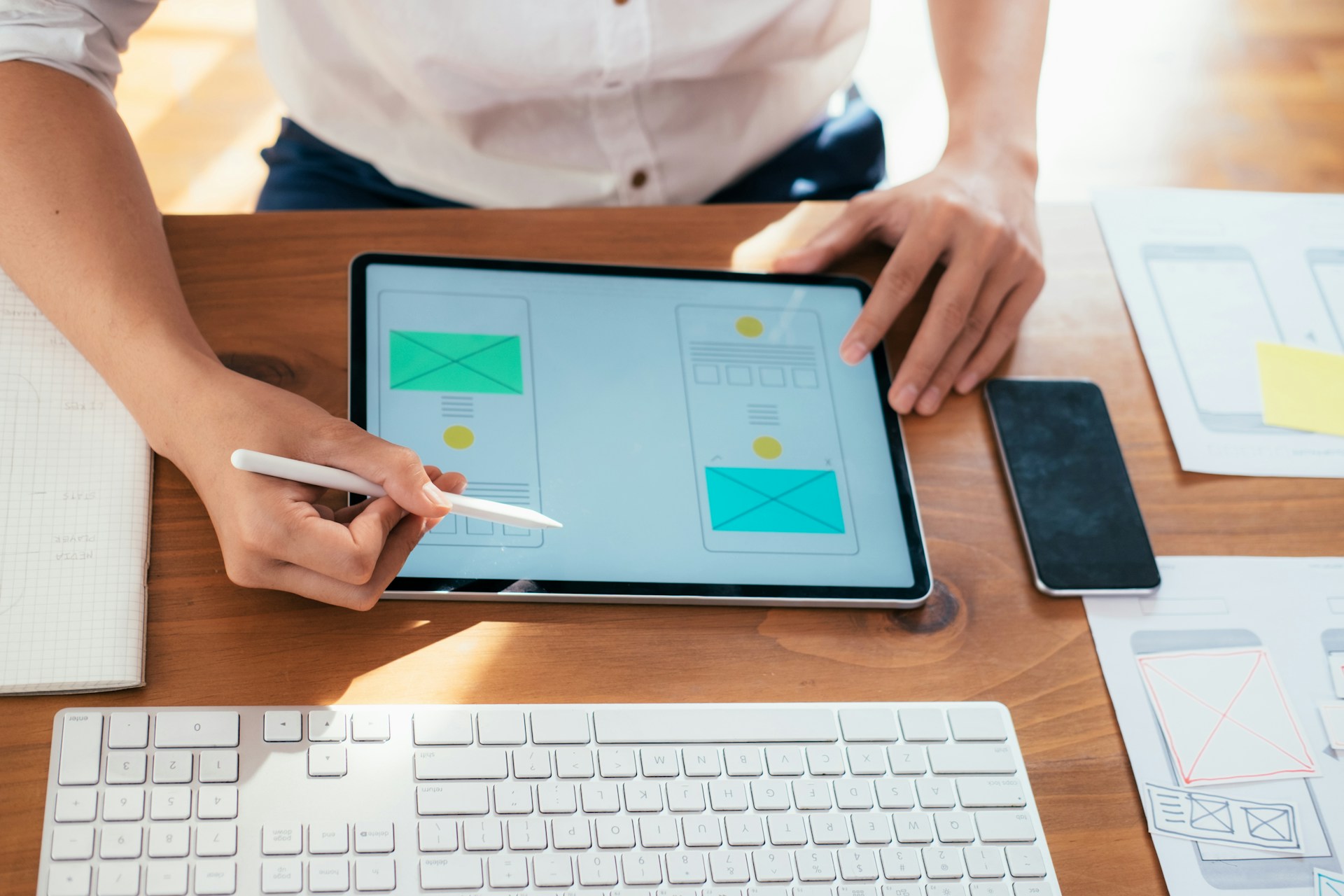
Summer in Houston feels different. The heat rises early, afternoons stretch long, and almost everything people do leans more outside. Whether it’s checking hours from a patio or searching for lunch from a car, the way people use websites changes with the temperature.
Menus especially need to keep up. If they are hard to find or confusing to read on a phone, people move on fast. When we think about improving web design in Houston, we often start with the menu. A smart, simple design can keep users from clicking away before they even look.
We build menus with the season in mind. That means clear categories, flexible layouts, and buttons that people can tap without second-guessing. Backed by local habits and user-friendly tools, clean menus help short summer visits turn into real orders and booked tables.
Why Summer Behavior Affects Online Menu Use
Houston heat has a way of speeding people up. No one wants to spend too long staring at a screen when it feels like an oven outside. During summer, people check websites on the go, waiting in line, sitting in a hot car, or walking between shops. They are not settling in to browse. They are looking for quick answers.
That shift in behavior puts pressure on menus to load clearly and fast. If a page asks for a bunch of zooming, pinching, or scrolling, phone users will not stay. They will back out and look somewhere else.
- Most users will scroll quickly and leave if the layout feels crowded or slow
- Choosing where to eat or book is often a snap decision
- Mobile menus need to exist front and center, not behind several taps
- At BK Design Solutions, we build custom mobile menus and navigation structures for Houston businesses, making sure important actions are always visible and easy to access
Menus built for summer do not just work on mobile. They think like a phone user. They prioritize visibility in sunlight, ease of access, and straight-to-the-point structure.
Menu Layout Choices That Work for Houston Heat
When people click into a menu on a hot Houston day, they do not want the whole page to unfold in one long scroll. Instead, we focus on layouts built for quick choices without visual clutter.
One way to improve this is layout design that breaks menus into short, simple chunks. Clear categories help people get where they want fast, without reading everything in between.
- Use short, high-level menu categories like Drinks, Lunch, Snacks, and Sweets
- Add dropdowns or accordion sections to avoid endless scrolling
- Set the most popular or seasonal options at the very top of each list
- BK Design Solutions uses fast-loading menu layouts that keep selections at the top, allowing Houston customers to order or book even during hot, busy summer days
Order matters too. If a dish sells well or fits the season, it should be first in line. That way people do not miss what they are likely to pick and can decide faster with less guessing.
Another helpful approach is testing which categories people tap first. This shows what stands out and what might get missed. By keeping track of these interactions, menus can be adjusted to put what matters most right where customers see it, reducing hassle and speeding up every visit. Over time, these small tweaks make a site feel just right for local users.
Design and Color Tips for Summer Visibility
Sunlight does not just make phone screens hard to read, it changes how people see everything. A beautiful photo grid or dark background might look fine in the evenings, but outdoors that same menu can be frustrating.
To help people see clearly, we lean into contrast and simplicity. That starts with choosing lighter backgrounds and clear, straightforward fonts.
- White or light-gray backgrounds improve screen readability outdoors
- Black or dark text gives a strong contrast for easy reading
- Avoid script fonts, especially in bright light, simple type is easiest on the eyes
- Limit images and avoid tight photo grids that slow load times or crowd the page
- All of our menus and user interface designs are tested for high-contrast visibility on phones, so Houston users can order fast, even when the sun is overhead
Photos can help a dish sell, but only if used the right way. It is better to feature one clean, well-lit photo per section than to line up four that load slowly or overlap. Cool tones and soft shadows tend to show better on hot screens too.
It also helps to stick to one or two accent colors. Overly bright palettes can make a menu harder to read, especially in direct sunlight. Calmer color choices make buttons pop without blinding people who are browsing on the go. When we design, we pick hues that stand out but still feel easy on the eyes in Houston sunlight.
Helping Locals and Visitors Navigate the Menu
Summer brings two kinds of users, locals hopping online to grab something quick, and visitors trying to figure out where to go next. Both groups need the menu to be clear without extra work.
Suppose someone from out of town pulls up the site on a hot evening. They do not know the difference between two items with local names. They are not sure if something is breakfast-only or still available. Straight labels save the day.
- Use plain and direct section names like To-Go, Specials, or Breakfast
- If items have local or creative names, add short descriptions
- Let users filter by dietary choices or price level, making picks feel easier
- Show takeout, delivery, or curbside options with icons or short links
Local customers already know what they like, but even they do not want to tap their way through five pages. If it takes them too long to see what is still available that day, they will settle for something easier. Clear options help everyone stay cool and stress-free.
Including a search option or filter can also make a difference. People like to sort by what matters most, such as price, portion size, or special features. Simple tools that help them narrow their choices quickly make the entire experience smoother, especially for a hot day or for someone trying a place for the first time.
The Quick Decision Advantage: Why a Strong Menu Pays Off
Good menus do more than get looked at. They make people decide faster. Whether someone is standing in line with their phone or comparing restaurants from a hotel room nearby, every second matters. A quick yes means one less customer lost to confusion or delay.
When we design with Houston’s summer patterns in mind, we reduce friction. Closely spaced buttons, outline-heavy layouts, and low-contrast text all make users bounce. But clear menus are like a green light. They feel smooth and help someone commit fast.
- Clean structure keeps the user’s eyes moving down the screen
- Bright, easy visuals mean less frustration in hot-weather browsing
- Simple copy and obvious buttons turn views into actions
Menus that work in summer keep your visitors steady through the heat, whether they are around the corner or new to town. By meeting people where they are, online choices stop feeling like a chore. They become quick steps toward the next iced drink, takeout order, or sit-down meal.
Ready to refresh your digital space for the Houston summer heat? At BK Design Solutions, we understand the importance of a seamless menu that aligns with seasonal user behavior. Our team specializes in crafting user-friendly, aesthetically pleasing layouts that help your business thrive. Discover how our strategic approach to web design in Houston can transform your website into a potent vehicle for customer engagement. Connect with us today to explore the possibilities.